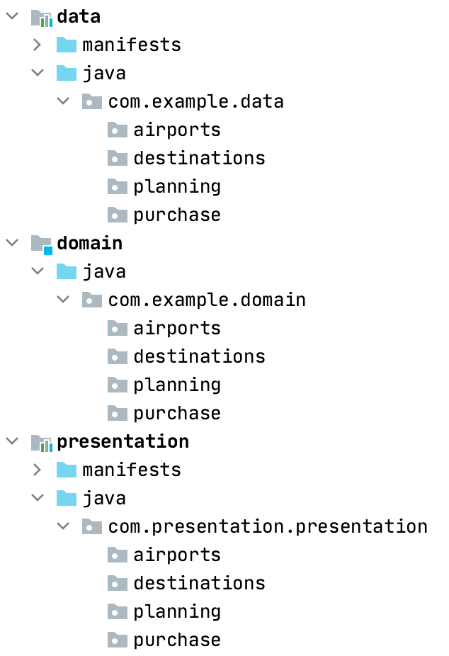
From Android to Multiplatform: Real 100% Jetpack Compose App. Part 2— Theme, UI Components and Screens
Welcome back for part 2 of migrating Android to Multiplatform app
Theme
The process of migrating the theme was relatively straightforward. Colours and shapes were easily copied and pasted without any issues. However, there were some challenges when it came to fonts. For my app, I’m using a custom design system based on the Material theme/components. But for the purpose of this migration, it’s essentially the same as using the plain Material theme. So, I faced no major obstacles in this regard.
Colours and shapes
You can simply copy and paste the existing code.
Typography
Before:
import androidx.compose.runtime.staticCompositionLocalOf
import androidx.compose.ui.text.TextStyle
import androidx.compose.ui.text.font.Font
import androidx.compose.ui.text.font.FontFamily
import androidx.compose.ui.text.font.FontWeight
import androidx.compose.ui.unit.sp
import com.example.android.R

val MonumentExtended = FontFamily(
    Font(R.font.monument_extended_black, FontWeight.Black),
    Font(R.font.monument_extended_regular, FontWeight.Normal),
    Font(R.font.monument_extended_light, FontWeight.Light),
)

data class Typography(
    val large: TextStyle,
    val mediumBold: TextStyle,
    val mediumLight: TextStyle,
    val small: TextStyle,
) {
    companion object {
        val Default = Typography(
            large = TextStyle(
                fontFamily = MonumentExtended,
                fontWeight = FontWeight.Black,
                fontSize = 24.sp,
                letterSpacing = 0.sp,
            ),
            mediumBold = TextStyle(
                fontFamily = MonumentExtended,
                fontWeight = FontWeight.Bold,
                fontSize = 16.sp,
                letterSpacing = 0.sp,
            ),
            mediumLight = TextStyle(
                fontFamily = MonumentExtended,
                fontWeight = FontWeight.Light,
                fontSize = 16.sp,
                letterSpacing = 0.sp,
            ),
            small = TextStyle(
                fontFamily = MonumentExtended,
                fontWeight = FontWeight.Light,
                fontSize = 10.sp,
                letterSpacing = 0.sp,
            ),
        )
    }
}

val LocalTypography =
    staticCompositionLocalOf { error("LocalTypography not provided.") }
After:
import androidx.compose.runtime.Composable
import androidx.compose.runtime.staticCompositionLocalOf
import androidx.compose.ui.text.TextStyle
import androidx.compose.ui.text.font.FontFamily
import androidx.compose.ui.text.font.FontStyle
import androidx.compose.ui.text.font.FontWeight
import androidx.compose.ui.unit.sp
import com.example.font

// font is the expect/actual function I shared in previous post

@Composable
fun MonumentExtended() = FontFamily(
    font("Monument Extended", "font/monument_extended_black", FontWeight.Black, FontStyle.Normal),
    font("Monument Extended", "font/monument_extended_regular", FontWeight.Normal, FontStyle.Normal),
    font("Monument Extended", "font/monument_extended_light", FontWeight.Light, FontStyle.Normal),
)

internal data class Typography(
    val large: TextStyle,
    val mediumBold: TextStyle,
    val mediumLight: TextStyle,
    val small: TextStyle,
) {
    companion object {
        @Composable
        fun Default() = Typography(
            large = TextStyle(
                fontFamily = MonumentExtended(),
                fontWeight = FontWeight.Black,
                fontSize = 24.sp,
                letterSpacing = 0.sp,
            ),
            mediumBold = TextStyle(
                fontFamily = MonumentExtended(),
                fontWeight = FontWeight.Bold,
                fontSize = 16.sp,
                letterSpacing = 0.sp,
            ),
            mediumLight = TextStyle(
                fontFamily = MonumentExtended(),
                fontWeight = FontWeight.Light,
                fontSize = 16.sp,
                letterSpacing = 0.sp,
            ),
            small = TextStyle(
                fontFamily = MonumentExtended(),
                fontWeight = FontWeight.Light,
                fontSize = 10.sp,
                letterSpacing = 0.sp,
            ),
        )
    }
}

internal val LocaTypography =
    staticCompositionLocalOf<Typography> { error("LocalTypography not provided.") }
Main difference is that MonumentExtended and Typography.Default were vals and they became @Composable functions. This didn’t have any implications for the rest of the code since I was using Typography inside other@Composable function:
@Composable
fun Theme(content: @Composable () -> Unit) {
    CompositionLocalProvider(
        LocalColors provides Colors.Default,
        LocalTypography provides Typography.Default(),
        LocalShapes provides Shapes.Default,
        content = content,
    )
}
Components
When referring to components, I mean the custom UI components that are part of my design system, such as buttons, top app bars, surfaces, and more. These components were mostly copy/pasted into the new codebase, with some adjustments made to the import packages. By migrating the theme, colours, shapes, and components, I was able to seamlessly integrate them into my existing Android app by simply adjusting the imports.
Screens
With the resources, theme, and components migrated, the process of migrating screens became much easier. The only challenge remaining was dealing with the ViewModels. However, by structuring the @Composable functions into stateful and stateless parts, it became a matter of straightforward copy/paste. I had stateful @Composable functions that observed the ViewModel's state and passed it to the stateless counterparts. With this structure in place, I moved all the stateless @Composables to the shared module, while the stateful ones remained in the Android module, observing and passing the state from the ViewModel.
After moving the stateless @Composables, I only needed to make some adjustments to the imports, and the app was up and running smoothly.
Example:
// android module
@Composable
fun CalendarScreen(
    onEditTasks: (LocalDate) -> Unit,
    onProfileClick: () -> Unit,
    modifier: Modifier = Modifier,
    viewModel: CalendarViewModel,
) {
    val state by viewModel.state.collectAsState()

    CalendarScreen(
        state = state,
        onEditTasks = onEditTasks,
        onProfileClick = onProfileClick,
        modifier = modifier,
    )
}

// shared module
@Composable
fun CalendarScreen(
    state: CalendarState,
    onEditTasks: (LocalDate) -> Unit,
    onProfileClick: () -> Unit,
    modifier: Modifier = Modifier,
) {
    ...
}
I did encounter an issue with the Pager component, as it wasn’t merged into Compose Multiplatform at the time. So, I used a third-party port. However, with the release of Compose Multiplatform 1.4.0, the Pager component was merged, and I could continue with the migration process without any problems.


